A histogram is a type of Excel graph used to analyze data by frequency of use. Histograms show how often one data element is used or mentioned within specific range. People who work with data and especially data analysis, should know how to make a histogram in Excel. It is particularly common when presenting demography of product users. For instance, if you want to present what is a common age of your product consumers, or from what countries people visit your website most, you can use histogram.
To make a histogram in Excel you need to follow the guidelines that apply to the version of Office on your computer. Guidelines differ from version to version and below you can learn how to make a histogram in Excel 2016 and 2013.
How to Make a Histogram in Excel 2016
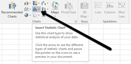
Choose the data you want to present in histogram and click on the Insert menu. In the Charts tab click on the Insert Statistic Chart as shown on the image below.
Another way is to click on the Recommended Charts and then on All Charts tab.
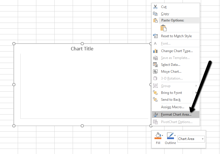
If you want to change the look of your histogram, right click on the histogram axes and then Format Chart Area.
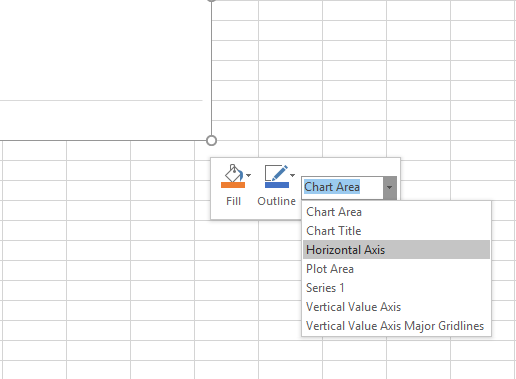
Thus, you can change the fill and the outline of the chart area, title, horizontal axis, plot area and vertical values. For instance, if you click on Horizontal axis as shown on the image below, the Format Axis sidebar will appear with Axis Options where you can set up the width of the bins, number of bins or set up category. In the same way, you can change the look of the chart of the text, in terms of color, shadow, and glow effects etc.
If you want to change data presented in the histogram, again right click on the histogram axes and then Select Data. Change the data range by typing different data values.
How to Make a Histogram in Excel 2013
In order to make a histogram in Excel you need to install Analysis Toolpak first and then to select two columns. In one column you will place the data you want to present via histogram. The other bin is to put the elements you will use to measure the frequency.
In the first column make sure you enter numeric data and not textual, because histogram won’t work as textual data. In the second column, you need to add the bin numbers. Click on the Data menu and then Data analysis. In the Data analysis window choose Histogram option and then click OK.
Enter the proper values in the Bin range and Input range box. In the Output options select the location where you want to put your histogram: the same worksheet, the same workbook but different worksheet or a different workbook.
If you want to show the data in descending order, select the Pareto histogram. To customize your histogram you can apply similar settings as previously mentioned in the guide for version 2016.
Having histograms in your Excel document will definitely help with data analysis and comparison. Presenting data visually makes people remember and understand better the analyzed data.


