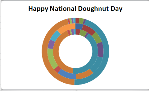
If you are a Twitter user, you may have learned that today is the National Donut Day. For that reason we decided to share with you some tips on using doughnuts, but not real doughnuts though. Did you know that there is an Excel chart called the Doughnut Chart? As the name implies, it has the shape of a doughnut and it is used for data visualization. There are a lot of charts in MS Excel you can use to present data, but we can safely conclude that this one is the sweetest one. Even if you are not so fond of making charts in Excel, maybe you will reconsider using them.
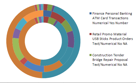
Doughnut charts help you present complex data in attractive and visually appealing way. If you have a very big collection of data and multiple subcategories in it, doughnut charts would be perfect for pulling out the data in a neat and readable fashion. You can separate subcategories of the data in different layers and each layer can be colored differently. Eventually, your data will be plotted in a multicolored doughnut.
In addition to that, you may choose between a regular doughnut chart and an exploded doughnut chart. Explored doughnut charts are very similar to exploded pie charts in terms of data visualization as each data segment is presented separately from the others.
So here is how you can present your data in a doughnut chart:
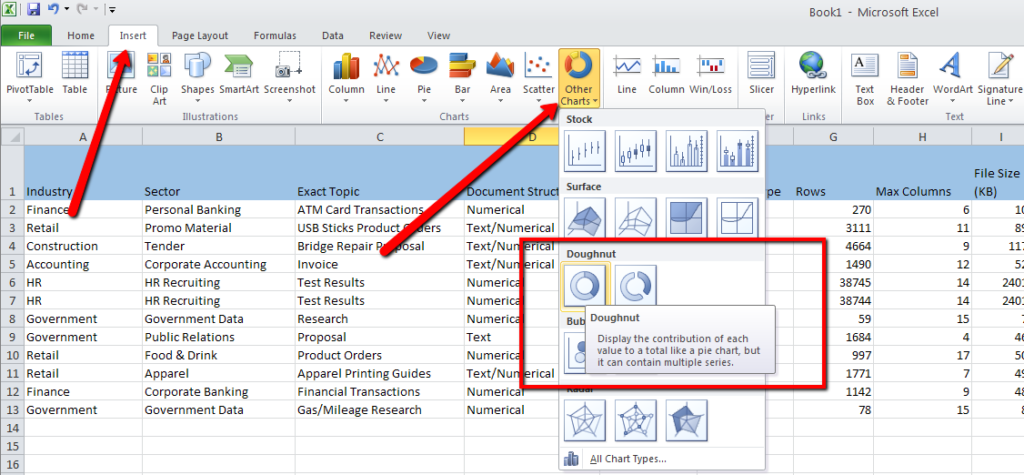
Open MS Excel and select the data you want to present visually. Then click on the Insert menu and then on the Other charts button to open a drop-down menu where all the charts are listed. There you will find the Doughnut chart, as shown in the image below.
First select the data you want to present in a chart. The Chart Tools menu will open and you will be able to choose the chart layout and style.
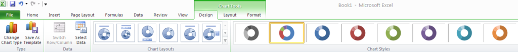
The chart will come up on the screen and on the right side of the Chart Tools you can click on the Move Chart Location button in order to move your chart according to your preferences.
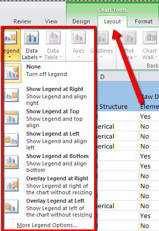
Once you are satisfied with the chart design, you may click on the next tab of the Chart Tools called Layout. There you can set up the legend: you can choose to keep it or not, and to place on the preferred side of the chart as shown in the image below.
In addition to that, you can give your doughnut chart a name by clicking on the Chart Title button.
And what is more, you can add the data labels such as percentage, date, time, accounting, currency and much more, by clicking on Data Labels.
Now you know it! There are other doughnuts apart from those you eat and they can help you in everyday data management tasks. Whether you have used Excel charts before or not, we are sure you will consider using them in the future. In the meantime you can enjoy the real doughnuts.
Happy National Doughnut Day!


